Designing a Brand Built for Growth
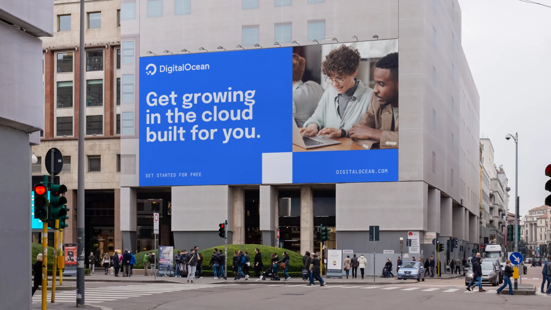
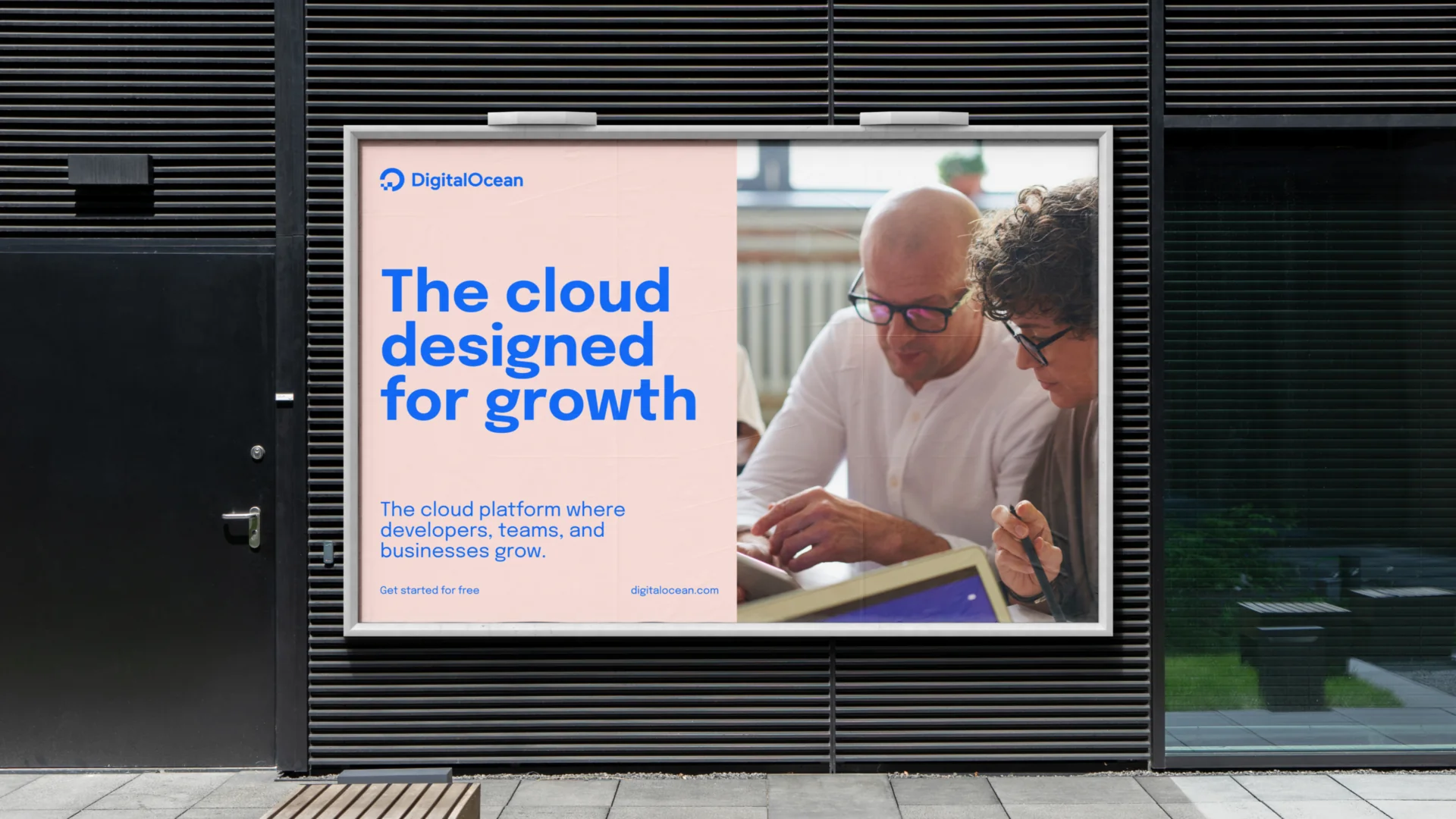
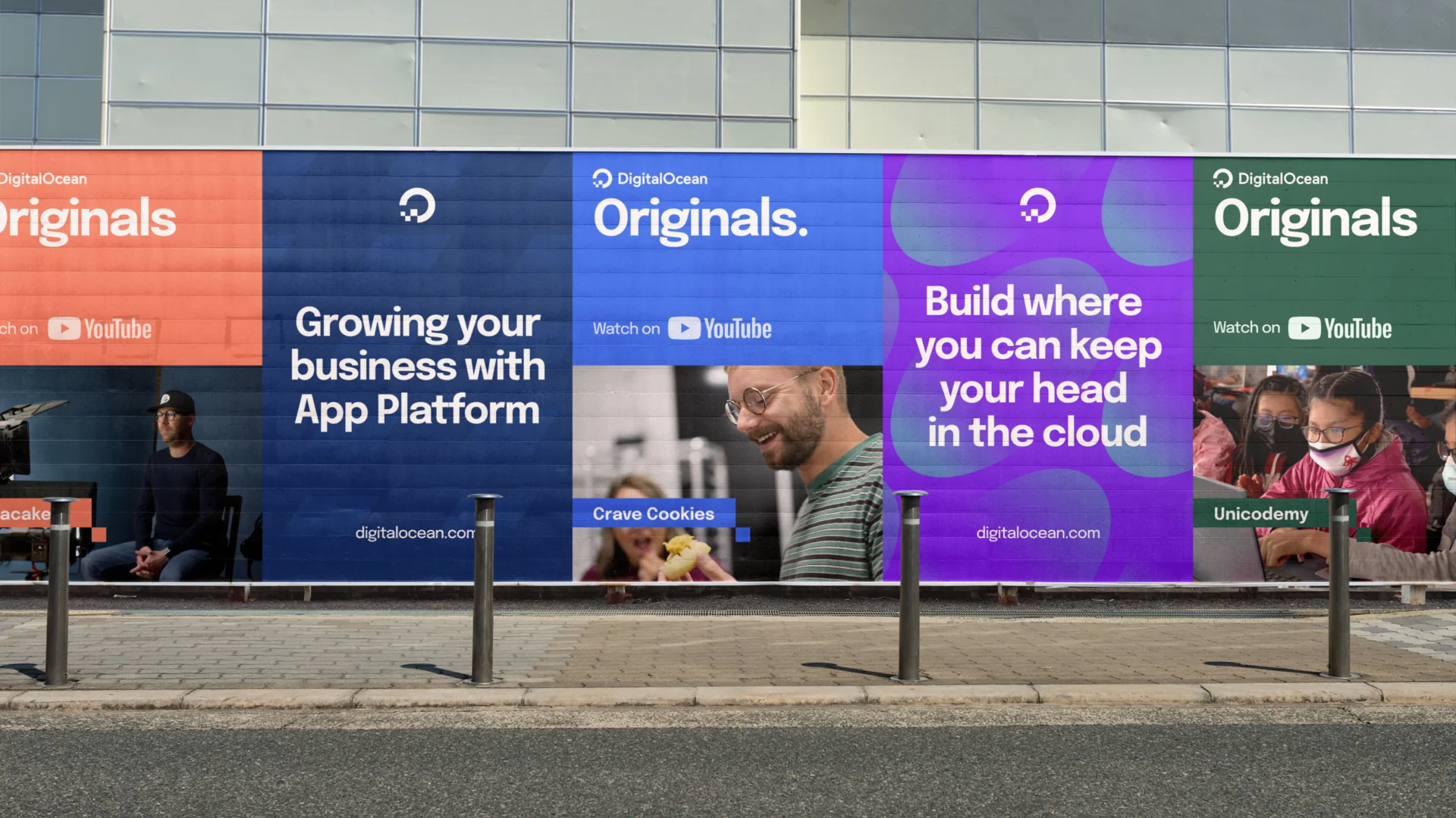
As design lead at Grizzly, I helped refresh DigitalOcean's brand after its IPO, turning a fragmented visual history into a clearer, more ownable system that kept the developer spirit intact while giving the business room to grow into a broader audience.
OutcomeA clearer positioning idea, a more consistent visual language, and a flexible digital-first system built to carry marketing, product storytelling, and campaigns.
The Challenge
Cloud had already become the operating layer of modern business, but the category was split. Enterprise giants like AWS, Azure, and Google Cloud offered enormous scale and deep infrastructure. Developers and small-to-medium businesses needed something more approachable: flexible, powerful, and clear enough to build without becoming infrastructure experts overnight.
DigitalOcean had built real love with developers, but after going public in 2021 it needed to grow beyond that original audience without losing what made people care about it. Years of visual evolution had also left the brand fragmented, with different styles, illustrations, and expressions living side by side and creating noise where the company needed confidence.
- Preserve developer credibility while speaking to growing businesses
- Make a brand that feels simpler and more human than enterprise cloud
- Consolidate years of visual expression into one coherent system
- Make "growth" feel like more than a marketing claim
- Build a language flexible enough for product, campaigns, and community
Reframing the Opportunity
The work could have become a conventional refresh: new colors, new type, new campaign language. The stronger opportunity was to give DigitalOcean a clearer role in the category. The big providers were built for vast organizations; DigitalOcean could own a different emotional space, the cloud platform for people and teams with ideas in motion. That became the center of the work: Get growing. It was direct, open-ended, and true to the audience — developers, founders, and SMB teams didn't need a cloud provider to make them feel small. They needed space, time, and confidence to build what came next.
Make DigitalOcean feel like the cloud platform that gives builders room to grow.
My Role
I led design on the Grizzly side, focused on turning the "Get growing" strategy into a usable, expressive system. It wasn't just a visual refresh — it was a translation exercise across positioning, identity, motion, campaign thinking, and digital application. The work needed to feel polished enough for a public company entering its next stage, while staying close to the builders and teams who made DigitalOcean matter in the first place.
I worked hands-on across identity and digital expression, shaping how "Get growing" could show up as more than a line of copy. My focus was the practical design layer: how the system holds together, how the brand stays expressive without becoming inconsistent, and how internal teams could keep extending it after launch.
- Leading design direction across the refreshed identity system
- Translating the "Get growing" strategy into visual and digital expression
- Consolidating fragmented brand styles into a unified language
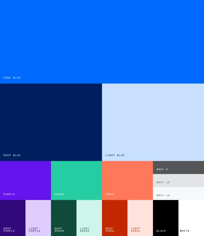
- Exploring type, color, illustration, pattern, and motion applications
- Designing flexible components for digital touchpoints
- Collaborating with strategy, copy, marketing, and product design
- Keeping the system expressive for campaigns, disciplined for scale
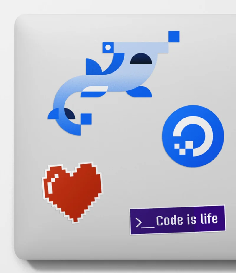
Discovery
We worked closely with DigitalOcean's marketing, digital experience, and product design teams to understand where the brand had equity, where it had drifted, and what the next stage of the company required. The audience didn't simply need servers, storage, and compute — they needed momentum, a provider that felt like it was on their side while they built products, launched companies, and learned in public.
Developer affection was worth protecting
The refresh couldn't abandon the simplicity and builder-first spirit that made the brand beloved.
SMBs wanted confidence, not complexity
Growing teams wanted power, but also clarity and a sense that the platform wouldn't slow them down.
The visual system had become fragmented
Multiple eras of brand expression were still visible, making the brand feel less singular than the business it needed to become.
Growth was the emotional bridge
"Growth" connected developers, founders, and businesses without forcing the brand into generic enterprise language.
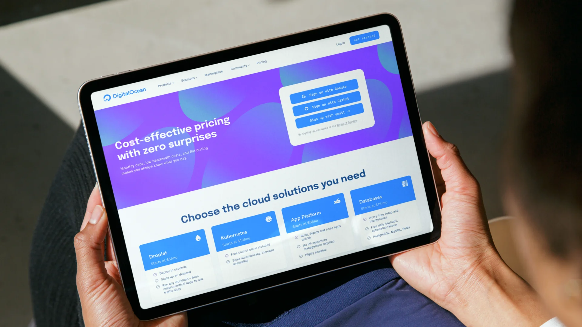
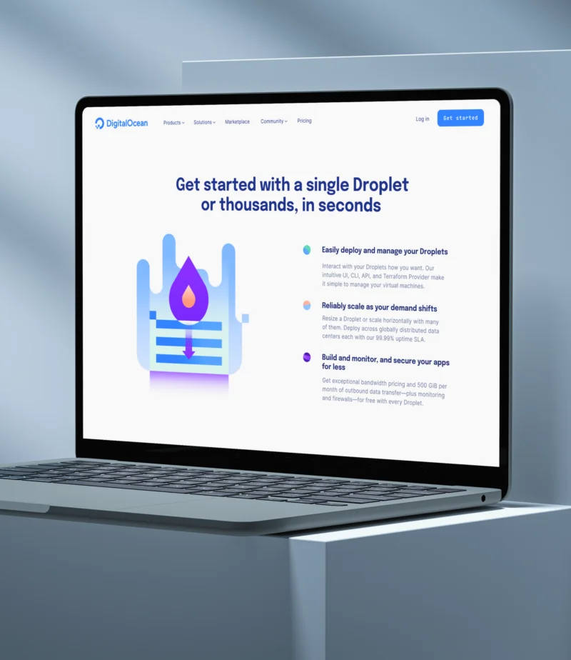
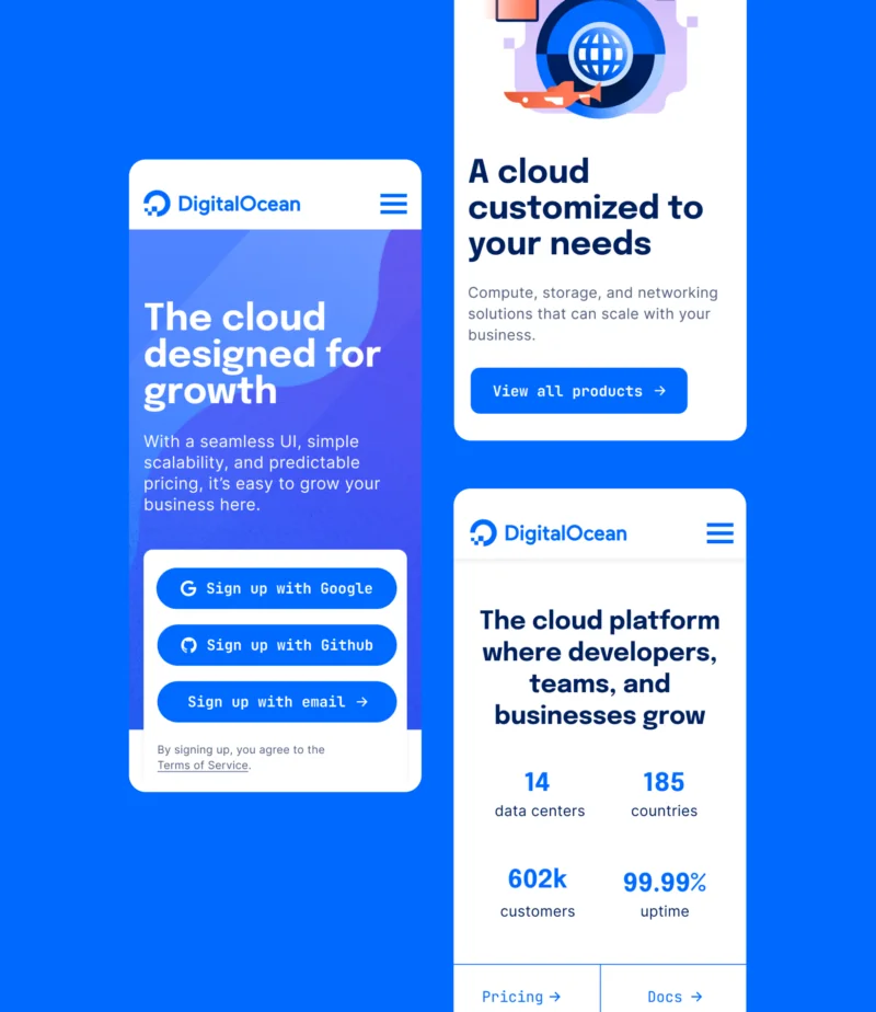
Design Approach
Preserve the builder spirit
The simplicity and directness developers already loved couldn't be a casualty of growing up.
Make growth tangible
"Growth" had to feel like real momentum, not an abstract business word.
Reduce visual dissonance
Years of accumulated styles needed one clear, confident system to live inside.
Keep the system digital-first
Every decision was built to work on screen first, then extend outward.
Expressive parts, clear rules
Type, color, illustration, and motion each had a defined job, with room to flex.
Build for teams, not launch day
The system had to keep working long after the refresh itself shipped.
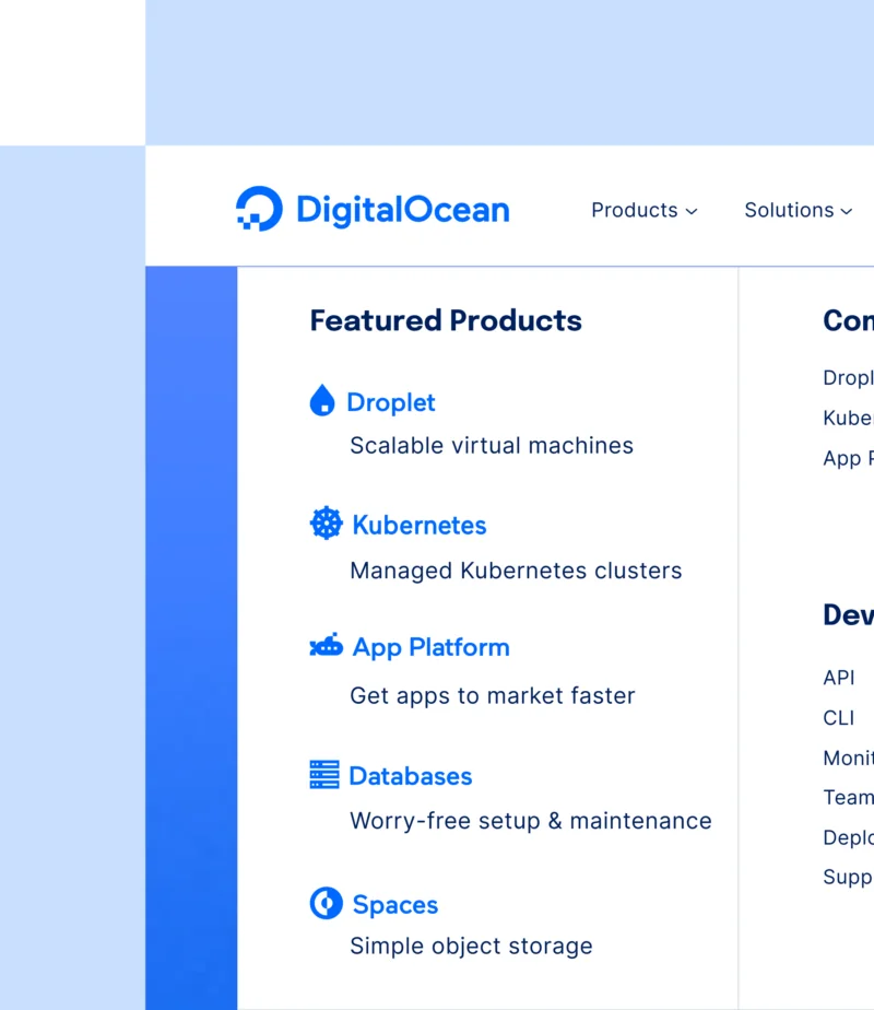
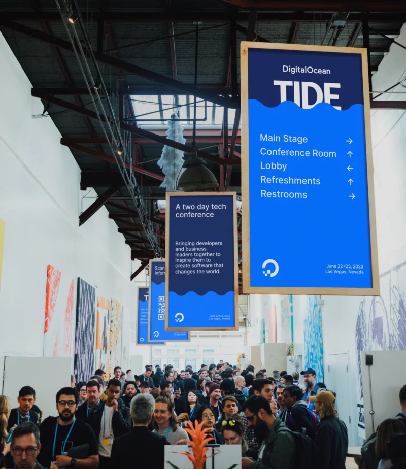
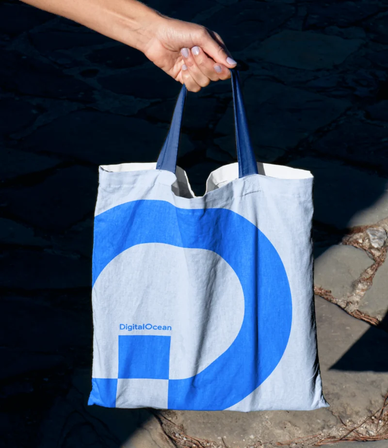
Outcome
The refreshed brand helped DigitalOcean show up with more clarity and confidence at a major growth moment. It gave the company a way to speak to developers, startups, and SMBs through a shared idea, while giving internal teams a more coherent visual system to build from.
- Consolidated a fragmented brand history into a clearer, more ownable system.
- Translated DigitalOcean's growth strategy into a usable visual and messaging platform.
- Preserved the brand's developer-first warmth while broadening its appeal to SMBs.
- Built a flexible digital-first identity that scales across campaigns, product, and community.
- Gave marketing, digital, and product teams a shared language for the brand's next stage.
Reflection
This project was a reminder that brand systems don't become scalable by becoming neutral. They scale when the idea is clear enough for many people to use and the visual language has enough structure to flex without falling apart. For DigitalOcean, the work was about protecting what people already loved while helping the brand mature. Push too far and the brand loses its developer soul; stay too close to the past and it can't carry the company's next chapter. The value of the work was in finding the middle: a system disciplined enough to unify the brand, and energetic enough to keep it unmistakably DigitalOcean.