Making Cloud Remediation Feel Human
As lead visual designer at Grizzly, working alongside the brand strategy team, I shaped the UI and motion of Dazz's launch, a cloud security company built around a sharper promise: remediation should be as clear and actionable as detection.
OutcomeA website and expanded visual system that brought clarity, warmth, and momentum to a category often defined by fear, density, and technical overload.
The Challenge
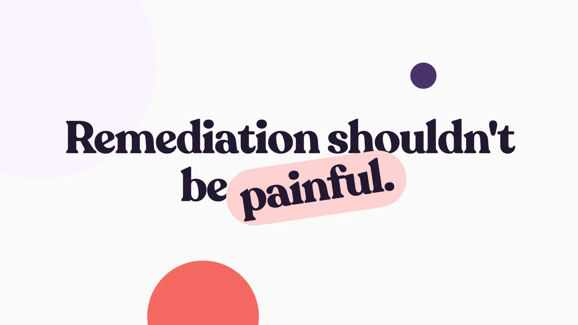
Cloud security teams are surrounded by detection tools. Alerts come from every direction, each pointing to risk, exposure, or a potential vulnerability. The harder question is what happens next: which issues matter most, who owns the fix, and how quickly teams can move from awareness to action. Dazz came to Grizzly preparing to launch out of stealth with a product built around that gap. It had a strong founding vision and a preliminary brand foundation, but needed a digital experience that made the product's value immediately understandable, without defaulting to the category's dark, fear-based visual language.
- Explain remediation without burying visitors in jargon
- Feel credible without the category's fear-based darkness
- Turn a complex product workflow into a memorable story
- Extend an early brand foundation into a launch system
- Balance technical seriousness with optimism and wit
Reframing the Opportunity
The project started with a launch need, but the deeper opportunity was positioning. Most cloud security brands compete on vigilance: more issues, more alerts, more exposed risk. Dazz needed to claim a different territory, less noise and more action. That reframing became the spine of the experience. Instead of presenting Dazz as another dashboard in a crowded tool stack, we shaped the story around the sequence security teams actually feel: discover, reduce, and fix, moving from complexity toward resolution.
Make remediation feel clear, approachable, and possible, without reducing the seriousness of the work.
My Role
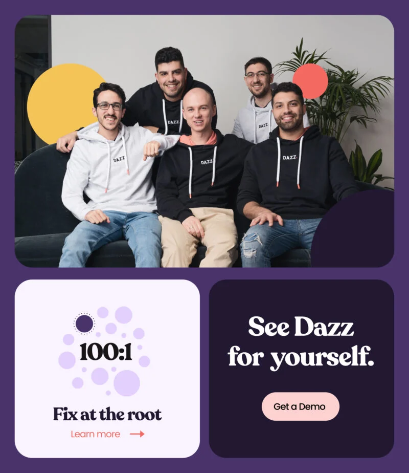
I led the visual design — UI and motion — on the Grizzly side, working in close partnership with the brand strategy team to connect brand expansion, visual language, product storytelling, and the website experience into one coherent launch system. My focus was translating a technical product into a story people could understand quickly, then giving that story a visual and interaction language that felt ownable for Dazz.
- Visual design direction — UI & motion
- Discovery and digital workshops
- Brand strategy translated into a usable framework
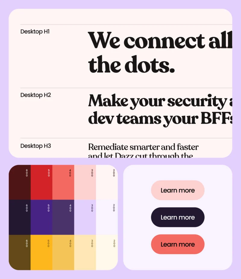
- Visual system expanded from Dazz's foundation
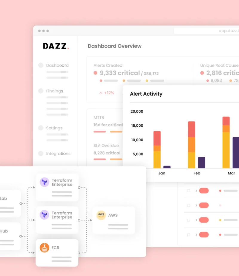
- Website storytelling sections and page rhythm
- Visual language for concepts, icons, and illustration
- Collaboration across strategy, copy, and development
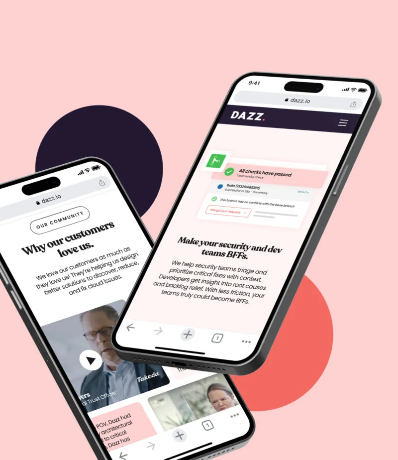
Discovery
Through discovery sessions and digital workshops, we looked for the clearest overlap between Dazz's product promise, buyer pain points, and company personality. The consistent theme was simple: cloud remediation should not feel painful. That gave the brand permission to behave differently, warm and playful without ever feeling lightweight.
Detection overload was the category norm
Security teams already had tools surfacing risk from every direction. The sharper opportunity was helping them act on what actually mattered.
Remediation needed a more human story
Dazz's value wasn't only technical coverage; it was the ability to connect security and development teams around a fix.
The brand needed to contrast the category
A dark, threat-heavy aesthetic would make Dazz blend in. A brighter system could signal a different posture: confident, practical, and energized.
Simplicity had to be earned
The experience could be friendly, but it still had to show depth. Clear copy, structured pages, and thoughtful product metaphors carried the complexity without dumping it all at once.
Design Approach
Clear before clever
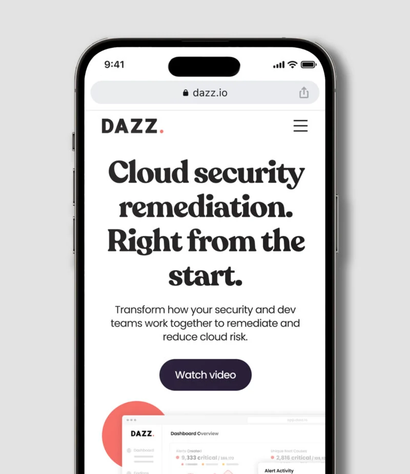
The core idea had to land fast — discover, reduce, fix — before any flourish earned its place.
Optimistic, not naive
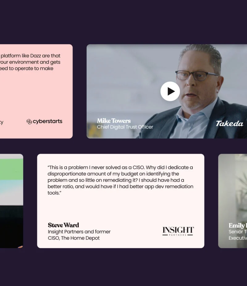
Brightness and warmth signalled a different posture without softening the seriousness of the work.
Technical, made approachable
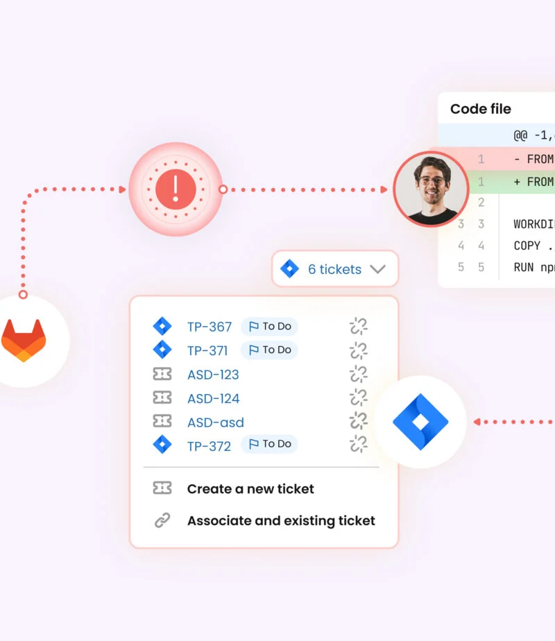
Product metaphors, icons, and plain copy carried real depth without overwhelming the visitor.
Soft forms, strong structure
Rounded shapes and flexible layouts stayed disciplined by a clear, dependable page system.

Outcome
The launch gave Dazz a differentiated position in cloud security: serious about remediation, but unwilling to inherit the category's fear-first language. By pairing a clear product narrative with a brighter, more flexible design system, the work helped Dazz explain a complex platform in a way that felt simple, memorable, and ownable.
- Expanded an early brand foundation into a launch-ready visual and digital system.
- Translated a complex remediation platform into a clear website narrative.
- Created a warmer, more distinctive alternative to conventional cybersecurity design.
- Aligned product, brand, and marketing around the sequence "discover, reduce, fix."
- Built a storytelling platform Dazz could grow well beyond the stealth launch.
Reflection
The most interesting part of the project was the tension: Dazz needed to feel approachable without becoming casual, simple without becoming shallow, and optimistic without ignoring the seriousness of cloud security. Leading the visual design meant holding those forces together. It reminded me that clarity is not the opposite of sophistication; in complex categories, clarity is often the most sophisticated thing a design system can do. For Dazz, that meant turning remediation from a technical backend promise into a visible, memorable experience.