HP Wolf Cloud Endpoint Manager
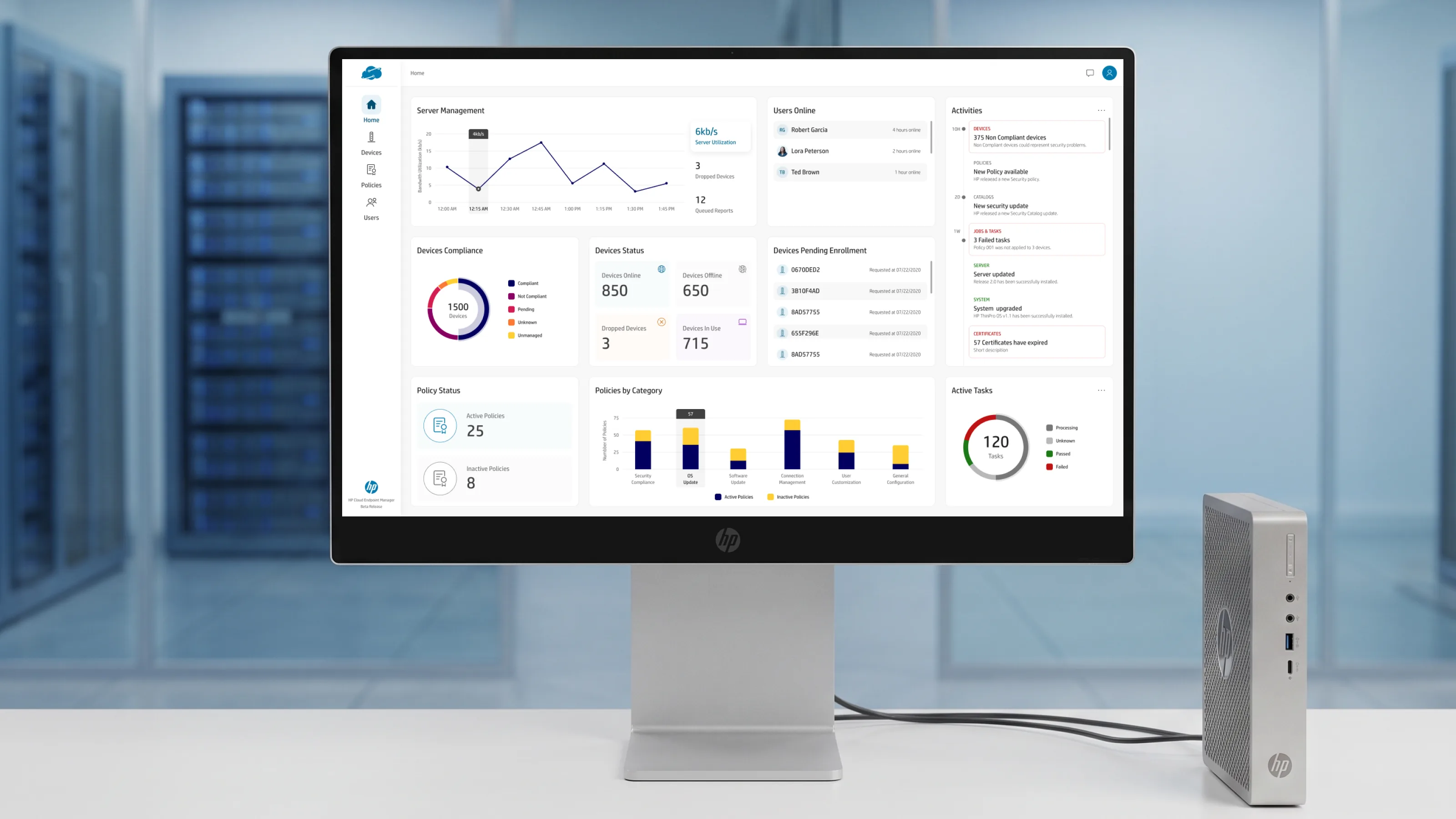
A cloud console for IT admins to manage entire fleets of HP Thin Clients from a browser — device enrollment, policy enforcement, compliance monitoring, and automated remediation, from ten devices to ten thousand without a redesign.
OutcomeA single Device Configuration pattern — one toggle-and-table primitive — absorbs 15+ configuration categories, so a new category ships as content, not a new screen.
The Challenge
An IT administrator responsible for endpoint fleets is not managing a handful of laptops. They are managing a retail chain's thousand checkout kiosks, a hospital's clinical workstations, a call center's thin-client floor — heterogeneous hardware, running different OS versions, spread across sites, each org caring about wildly different signals. What a hospital's compliance officer needs to see first is not what a retailer's store-ops lead needs to see first, and a console that hard-codes one opinion is wrong for almost everyone.
HP Wolf Cloud Endpoint Manager is HP's answer to that: a cloud-enterprise platform for policy-driven management, active monitoring, and 24/7 automated remediation of HP Thin Client fleets. The design problem was never "make the dashboard look good." It was strategic — define the information architecture, reusable product patterns, and safety rules that stay correct whether the admin oversees ten devices or ten thousand, and whether they are a day-one operator or a power user. I worked at the staff-IC level across the surfaces that carried that load.
- UX Strategy
- Information Architecture
- Componentization
- Edge-Case Modeling
- Cross-Org Trade-offs
The Approach
The through-line across every screen was the same discipline: design the decision model, not just the page. A fixed dashboard would have been faster to ship and wrong for most orgs; a fully drag-and-build BI canvas would have been technically flexible and a punishing day-one experience. The work lived in the space between those two failure modes — opinionated defaults that are useful out of the box, with the flex points exposed only where an org genuinely needs to differ.
That same reasoning repeats at every level of the product. A drag-and-drop that feels fast to a power user but can never silently change access for hundreds of devices. A policy-conflict resolver that works identically whether two policies disagree or two hundred do. A permission model that is a graph underneath but reads as plain categories on the surface. Each is a specific instance of one question — how does this stay correct at scale, for someone who should never have to think about the machinery underneath?
Overview
A unified, web-based management experience spanning device discovery and enrollment, policy authoring and versioning, reusable configuration templates, user and role administration, and fleet-wide compliance monitoring. The surfaces below were selected to show staff-level product design — UX strategy, componentization, edge-case modeling, and cross-org trade-offs — rather than a tour of every screen in the console.
Information Architecture
The console organizes around the objects an admin actually reasons about — devices, policies, templates, users — not around the backend's data model. Policies and templates are deliberately separate object types with a reference relationship between them, because that separation is what makes reuse safe and blast radius visible. Six primary surfaces, each with its own density and default opinion, calibrated to the job it does rather than to a single global layout.
An opinionated default that ranks compliance and security above vanity metrics — every card reorderable, hideable, resizable, so it fits a kiosk fleet and a hospital equally.
A permission-scoped group hierarchy with drag-and-drop, plus a per-device detail view spanning spec, capacity, BIOS, OS, and applied-policy state.
The compliance engine — authoring, drafts, versions and life-cycle, side-by-side conflict resolution, and a category-first view of what a policy actually does to the fleet.
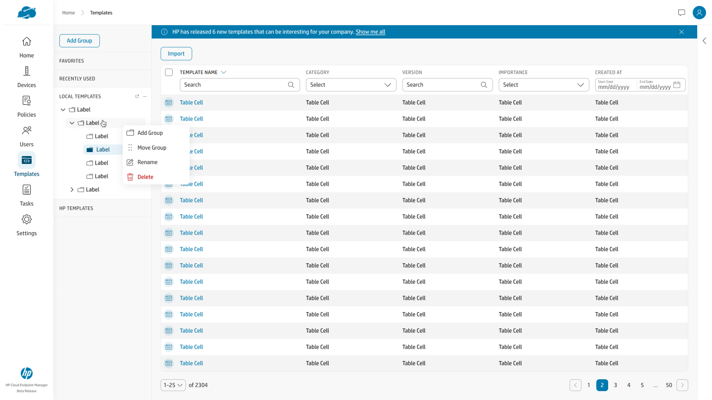
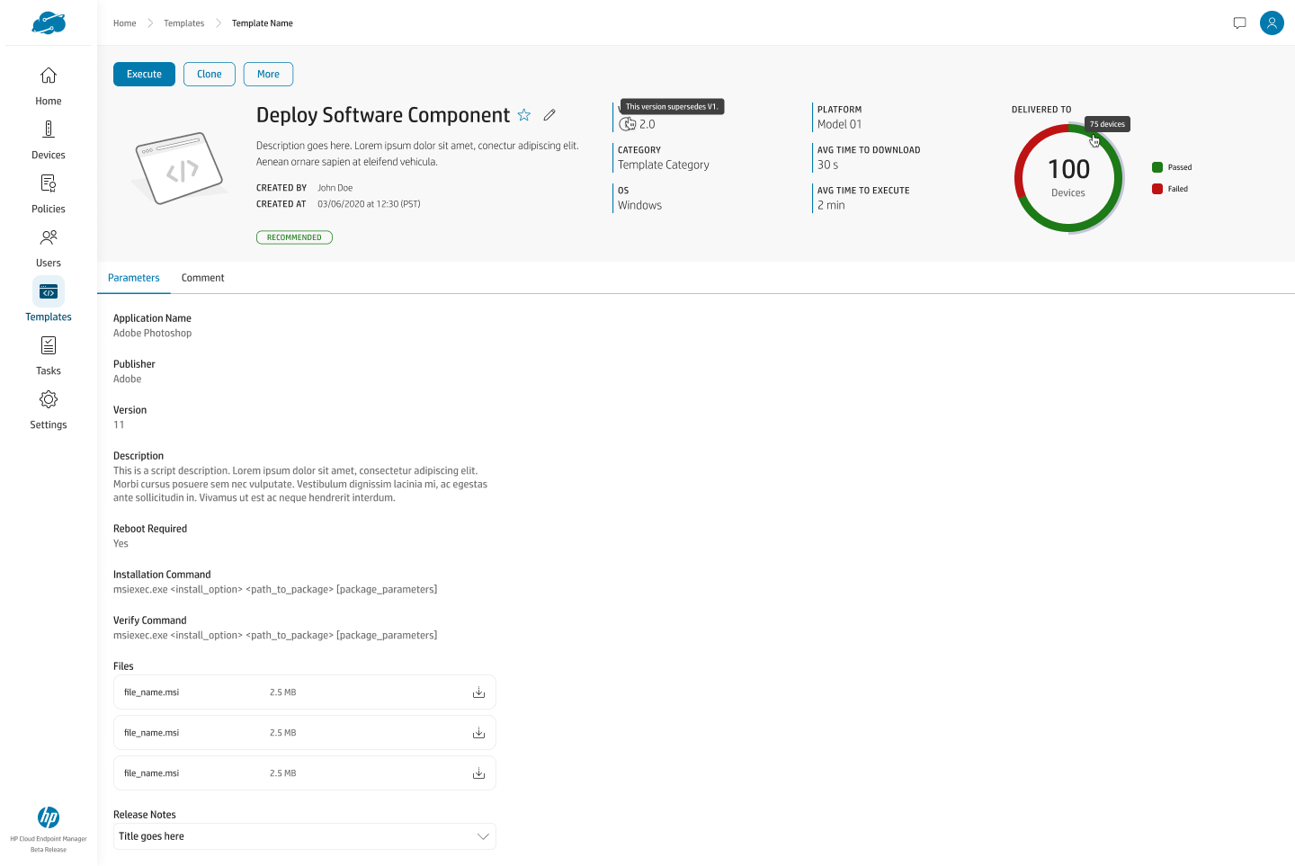
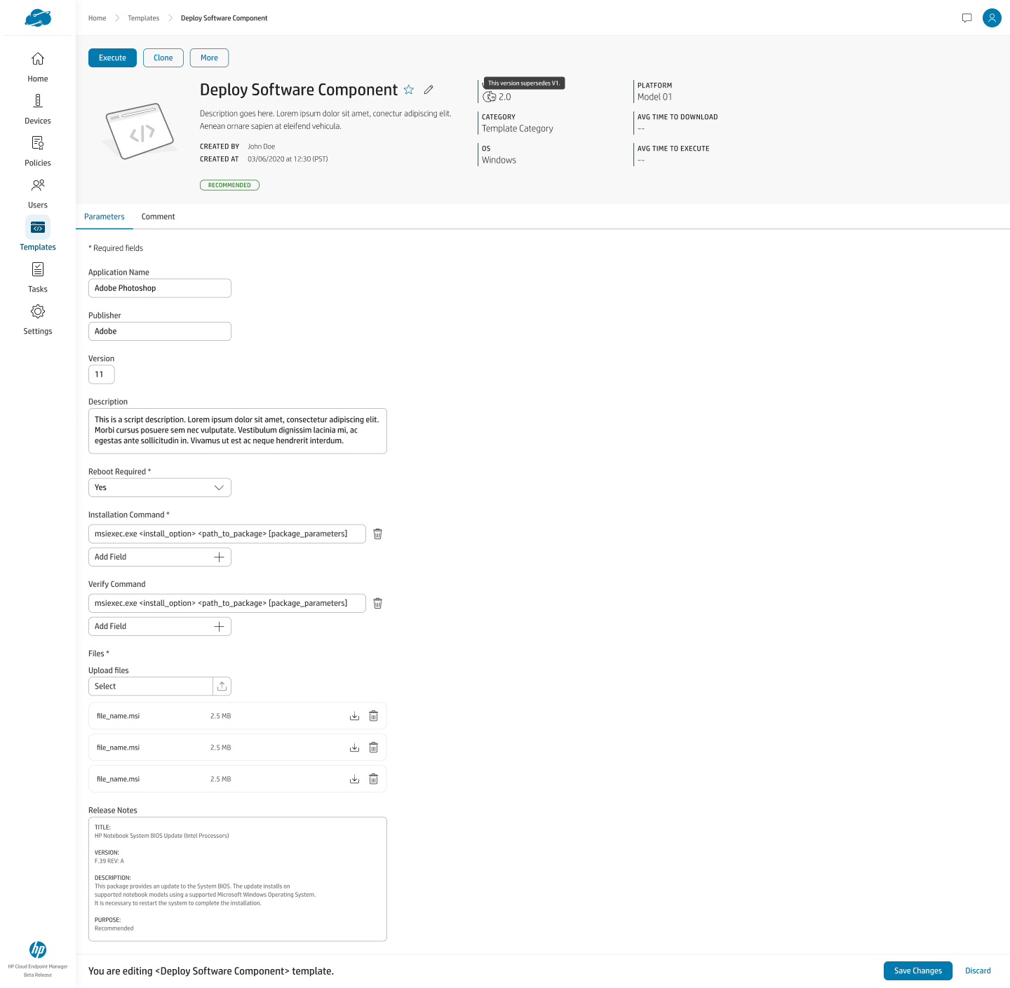
Standalone, reusable configuration objects referenced by — not copied into — the policies that use them, with an assigned-policies list that surfaces blast radius before an edit.
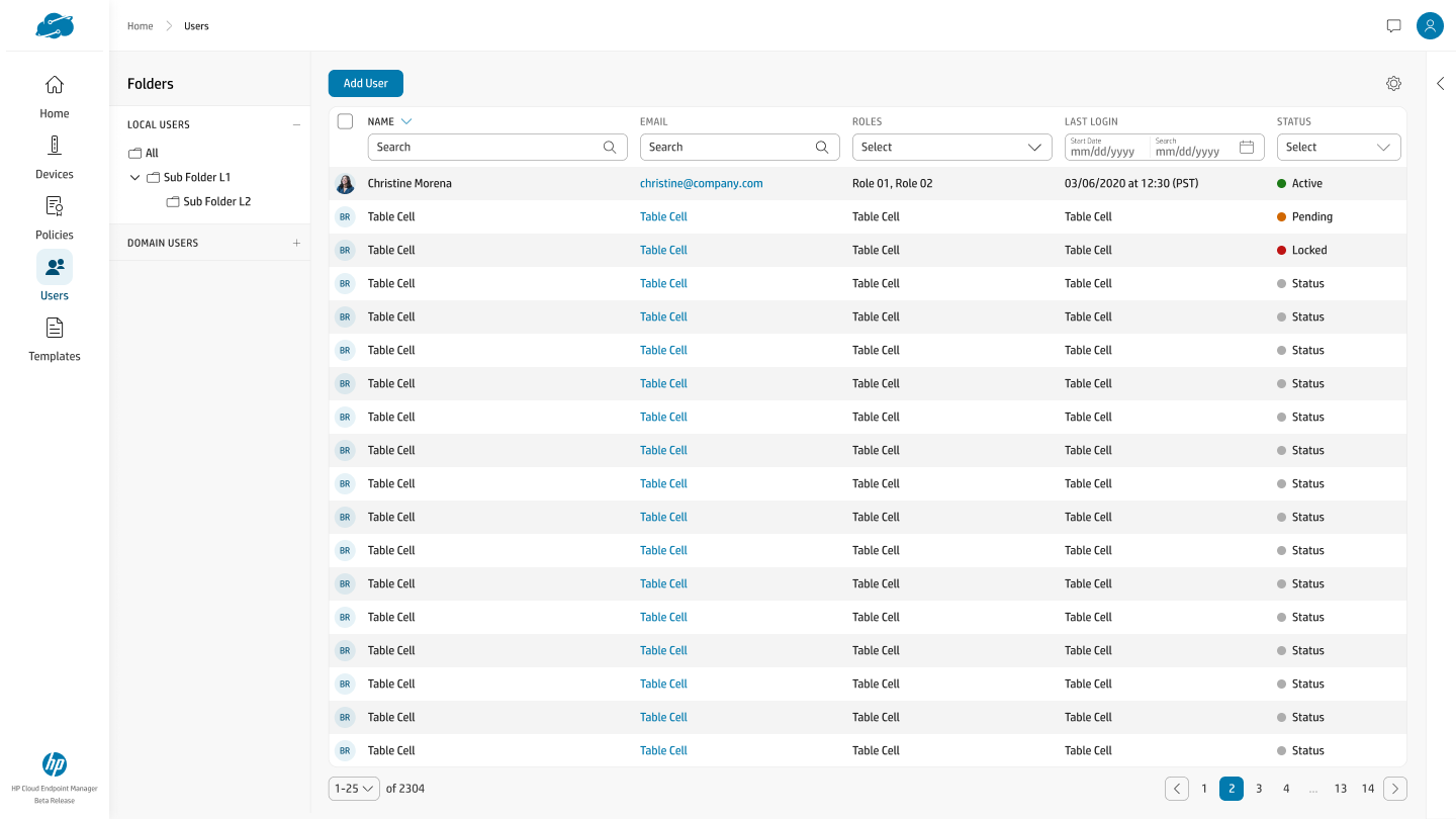
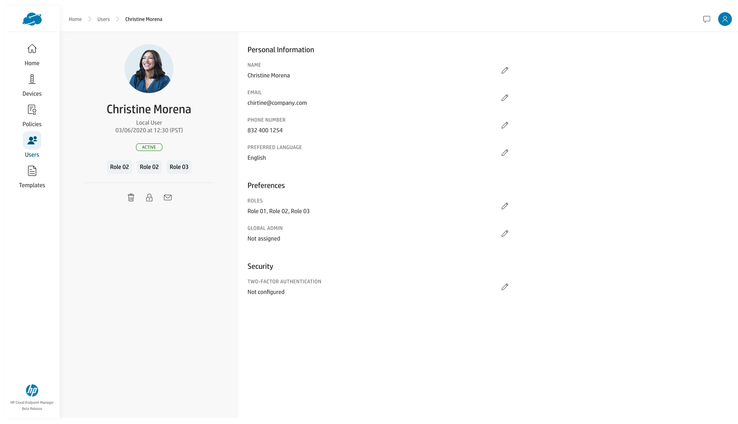
Local and domain users organized into folders, with roles and an explicit account-status lifecycle (active, pending, locked) rather than a single opaque flag.
The reusable primitive underneath policy and device configuration — one pattern flexible enough for a single toggle and a multi-field BIOS form, used everywhere so the surface reads as one coherent product.
Design Decisions at Scale
Six decisions, one per core surface — chosen because each is a place where the easy answer and the right answer diverge, and the gap between them is where staff-level design actually lives. Each names the problem, the constraint it had to satisfy, the alternative I rejected, and how it holds up at fleet scale.
The Home dashboard is a flexible card model, not a static page
Different IT orgs — retail kiosks, hospitals, call centers — care about wildly different signals, so a fixed dashboard is wrong for most of them. The constraint was to flex priority, density, and content per org without becoming a blank-canvas widget board an admin has to assemble on day one. I rejected the fully drag-and-build BI approach: technically flexible, but too much setup burden for a first-run experience. The default view is opinionated — compliance and security ranked above uptime and counts — and every card is reorderable, hideable, and resizable, so power users rearrange without ever hitting an empty state.
Drag-and-drop that can never make a silent, irreversible mistake
Nested, permission-scoped device groups are powerful and dangerous — moving one folder can silently change access for hundreds of devices. Drag-and-drop had to feel fast for power users while making an irreversible mistake structurally unable to happen quietly. I rejected auto-resolving scope conflicts by policy precedence: faster, but it removes the admin's chance to catch a mistake before it ships. Every cross-scope move (public ↔ private) raises a specific, legible confirmation — "move group X under Y" — so there are zero silent state changes.
Policy conflict is the main case, not the edge case
Two policies applied to overlapping devices will disagree eventually — at fleet scale that isn't a rare failure, it's inevitable. The resolution UI had to work whether there were two conflicts or two hundred, without forcing row-by-row review every time. I rejected a simple last-write-wins merge: technically simplest, but invisible and untrustworthy for security-sensitive work. Admins resolve bulk conflicts in a single action via one side-by-side resolution, then drop into per-category detail (Connections, Devices, Time & Language, Device Settings) only where it actually matters.
A permission graph, translated into something a human can reason about
The underlying policy model — scopes, overrides, inheritance — is a graph, not a list, and most admins should never have to think in graph terms. Every policy had to answer "what does this actually do to my fleet?" without a support ticket or an engineer's help. I rejected exposing the raw scope/override tree: accurate, but unreadable for 90% of admins. Instead, a category-first view maps to how IT teams actually think about configuration — security vs. connections vs. device settings — with one-click drill into applied groups and applied devices.
One configuration pattern that scaled across 15+ categories
Fifteen-plus configuration categories, each with different fields, needed to feel coherent rather than like fifteen bespoke screens. The abstraction had to be flexible enough for a single toggle (Wireless) and a multi-field form (BIOS) without forking the pattern. I rejected bespoke layouts per category: faster to ship one screen, but it multiplies design and QA cost by 15× and erodes consistency over time. One documented toggle-and-table pattern — enable-gate at the top, inline-editable table beneath, consistent add/remove — is reused across the entire Device Configuration surface, cutting new-category design time to near zero.
Reusable templates that surface their blast radius before you edit
Reusable templates are only safe if admins can see the consequence of changing one before they do it. The product needed real composability — write once, use everywhere — without creating a silent-update landmine across dozens of policies. I rejected copy-on-use templates, where each policy gets its own snapshot: safer in isolation, but it defeats the entire point of a reusable template. Templates exist as standalone objects (script, registry, BIOS, software), referenced rather than copied, and an "Assigned Policies" list makes every policy a template feeds into visible before the edit is committed.
Outcome
- Delivered the design for a shipped, live cloud console (hpcem.com) — device enrollment, policy enforcement, compliance monitoring, and automated remediation for HP Thin Client fleets.
- Designed the Home dashboard as a set of reorderable, opinionated cards, so one default layout serves retail, healthcare, and call-center orgs without a per-vertical redesign.
- Specified a single Device Configuration pattern that absorbs 15+ configuration categories, cutting new-category design and QA cost from a bespoke screen to near-zero content work.
- Made scale-safe by design: every cross-scope group move and every policy conflict resolves through a legible, explicit action — zero silent state changes across a fleet of any size.
- Separated templates from policies as referenced objects with a visible assigned-policies list, giving admins composability and blast-radius awareness in the same interaction.
Home — The Command Center
The console's landing surface, and the one screen most likely to differ org to org. Designed for information hierarchy at scale — an opinionated default that stays useful from a ten-device pilot to a ten-thousand-device fleet.
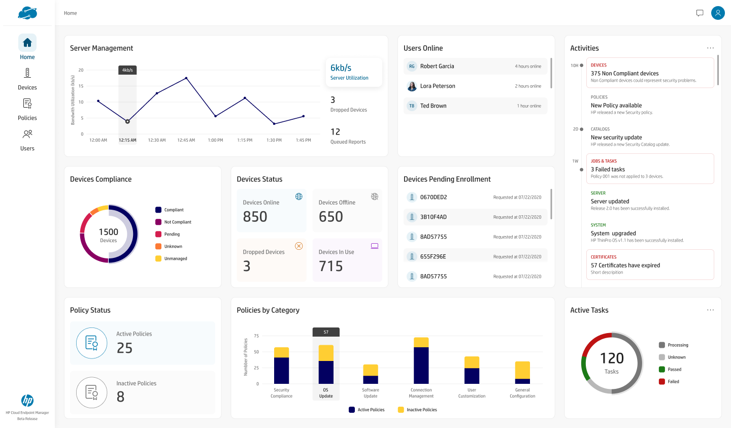
design rationale — M1 · Designing for information hierarchy at scale
Devices — Groups & Device State
The fleet inventory and its per-device detail. Handling structural complexity — nested, permission-scoped groups — without dumbing it down, and without ever letting a fast interaction cause a silent, irreversible change.
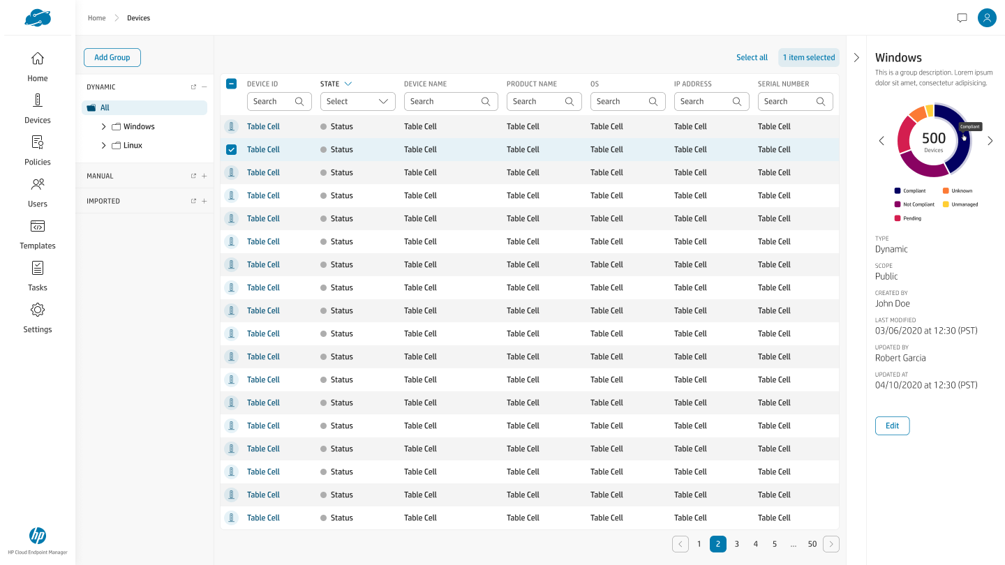
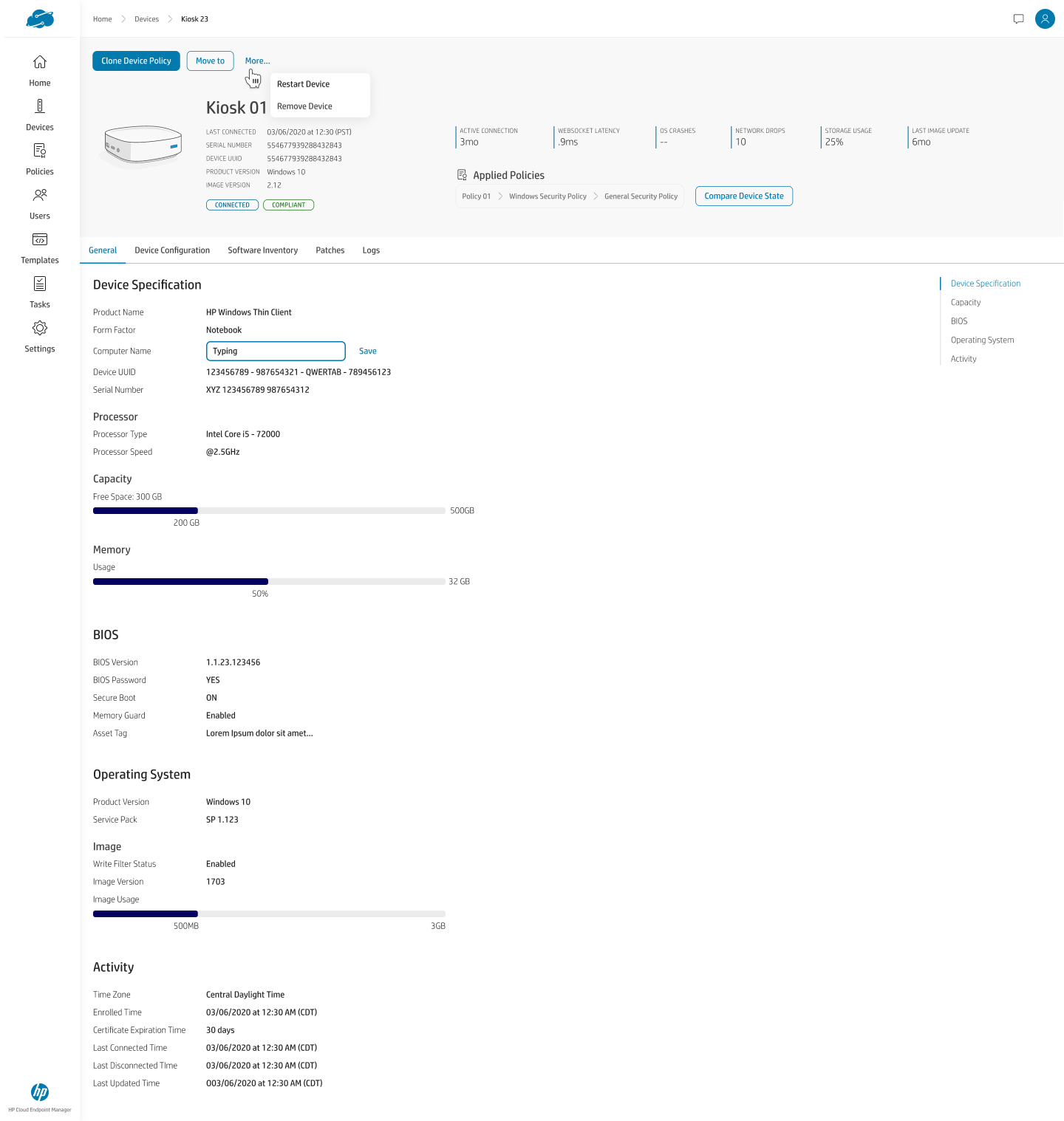
design rationale — M2 · Handling structural complexity without dumbing it down
Policies — Conflict, Scope & Configuration
The compliance engine — where the hardest UX problems live. Designing for the edge case that is actually the main case, translating a backend permission graph into something a human can reason about, and building one configuration pattern that scales across every category.
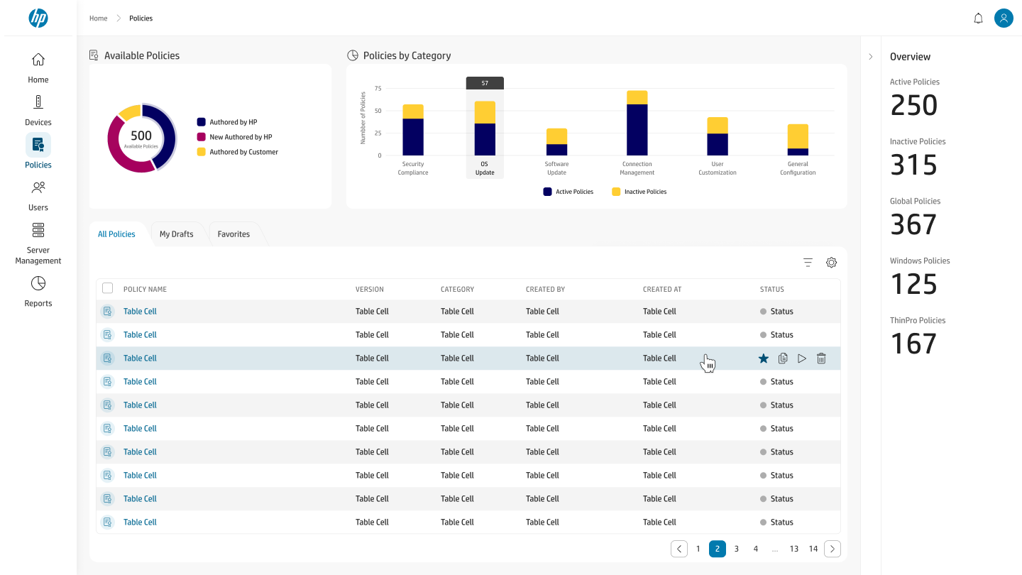
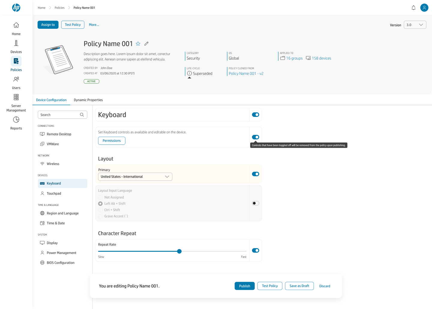
design rationale — M3 · Three decisions where the easy answer and the right answer diverge
Templates — Reuse & Composability
Reusable configuration objects — scripts, registry keys, BIOS settings, software packages — designed for write-once, use-everywhere composability without becoming a silent-update landmine across dozens of policies.
design rationale — M4 · Designing for reuse and composability
Users — Roles & Account Lifecycle
Administrator and user management — local and domain users organized into folders, with roles and an explicit account-status lifecycle rendered as first-class states rather than one opaque flag.