Folio
A calmer personal-finance app for the people who avoid their money — designed to replace shame and overwhelm with clarity, starting from a single honest number.
OutcomeEstablished an anxiety-aware pattern library — progressive disclosure, no red for spending — that shaped the build.
The Challenge
Most personal-finance apps are built for people who already enjoy thinking about money. They reward obsessive categorization and assume the user's problem is a lack of information. But the person who most needs clarity isn't underserved by data — they're overwhelmed by it. They avoid opening their banking app because they're afraid of what they'll see.
My client wanted to build for exactly those users — an app that lowers the emotional cost of financial awareness. I led product design from research through a build-ready screen system for iOS and Android.
- Generative Research
- Diary Study
- Content & Tone
- Product Design
- Design System
Research
Eleven in-depth interviews and an eight-person diary study, over six weeks — opening each session with life context before money came up, to lower the performance anxiety that skews finance research.
What I Designed
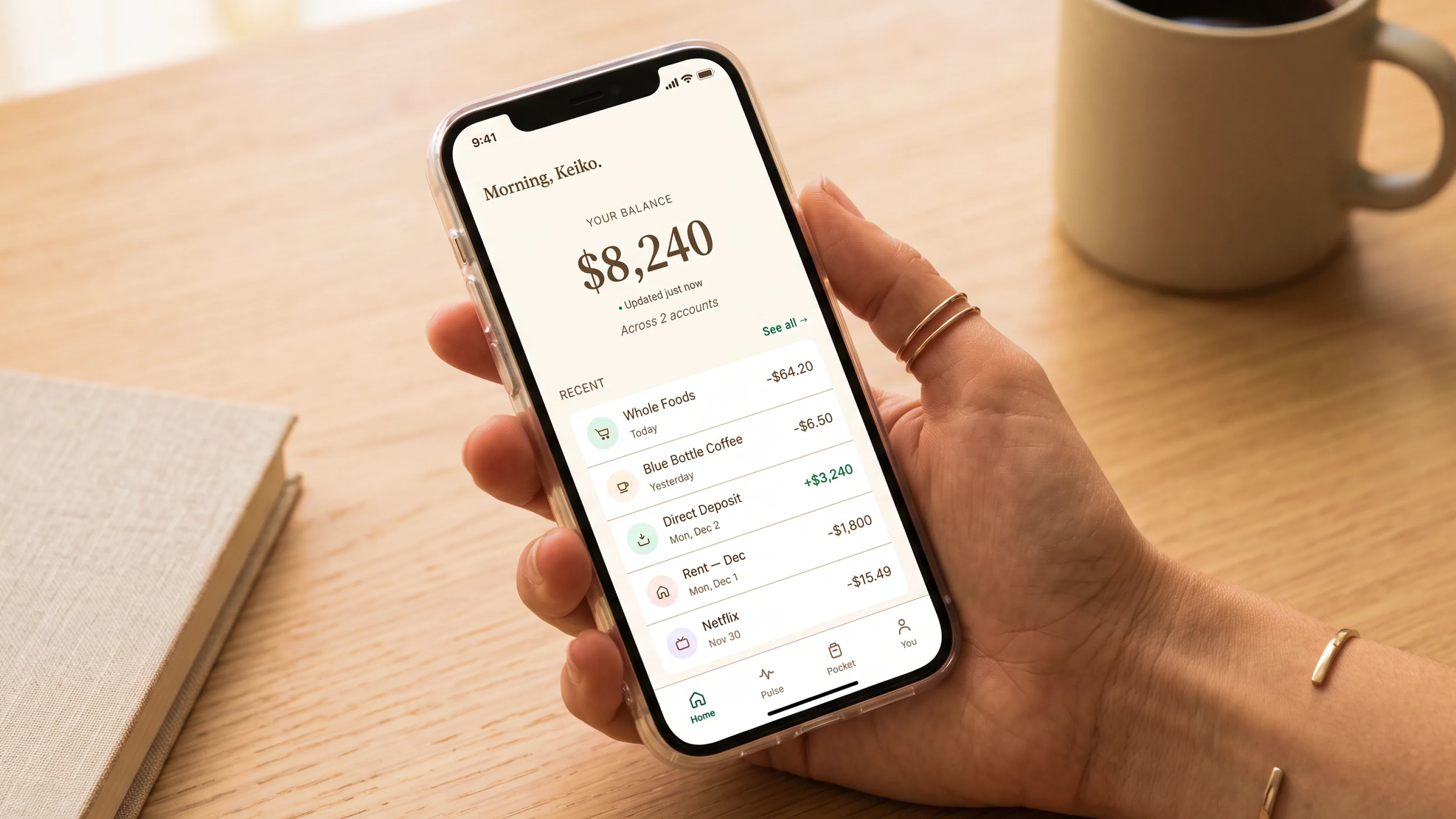
A single-number balance view that opens the app — calm, unadorned, no color-coded judgment. A weekly Spend Pulse that reports without grading ("you spent $X; your average is $Y"). Gentle, opt-in nudges that are warm rather than urgent. A Savings Pocket that's a mental model, not another account. And a private Clarity Score — a gentle mirror, not a grade.
Amber signals attention; red is reserved for genuine account problems, never for spending. The whole system reveals itself progressively, so the users who need it most aren't asked to set up a budget before they've seen any value.
Screens
The full case study, one thumb at a time. Onboarding earns the right to show more; the home screen is a single uncolored number; attention states use amber, never red; and every reveal is calm before it is informative.
The most important flow in Folio. Sofia has tried four other finance apps and deleted them all. This one has 90 seconds to earn her trust. Value before effort — a real balance before any setup requirements.
The screen Sofia sees every time she opens Folio. One number. Calm. Non-judgmental. The design must work whether the news is good or bad — it is never the app's job to tell her how to feel about her balance.
Sofia's balance has dropped below her comfort threshold ($500). This is the moment that most finance apps get catastrophically wrong — the red alarm, the budget warning. Folio's version is warm, factual, and gives Sofia a clear next step without creating a crisis.
Not a budget. Not a category breakdown. Just: this week you spent $X. Your average is $Y. A gentle rhythm — the financial equivalent of knowing whether you've been sleeping more or less than usual.
The mental model savings feature. Not a real account. Not a goal tracker. Just a calm visual space to set something aside in your mind. Marcus sets aside $150 for a new laptop. No fanfare. Just: acknowledged.
Revealed after 8 weeks. The most personal screen in Folio. A private mirror — not a report card. The Clarity Score asks one question: how many days this week did you have a clear picture of your finances? No comparison to others. No judgment if the answer is 2.
Outcome
- Delivered a build-ready product design for iOS and Android — research, flows, screens, and a content-and-tone system — handed to engineering.
- Reframed the product around a single honest number, letting users get value before any setup.
- Made tone a first-class design material, with a written system for warm, non-judgmental copy.
- Established an anxiety-aware pattern library — progressive disclosure, no red for spending — that shaped the build.